Base Config explained
The base config is written as yaml. This should make it easy to make your own changes because it is written exactly as you would in your dashboard.
You can find it here.
If you want to change things just override the parts you want to change.
In the end your config and the base config get merged so the strategy has all required configuration options.
Anchors
These are just YAML anchors. I use them to deduplicate similar config for the grids. You can use YAML anchors in your Home Assistant Configs too if you want! (Just note that you can not use those anchors i defined in my config (actions-info-ref, etc.)! They get resolved on a lower level so that will not work.)
---
-   actions-info:
        tap_action:
            action: more-info
        icon_tap_action:
            action: more-info
        hold_action:
            action: more-info
-   actions-toggle:
        tap_action:
            action: toggle
        icon_tap_action:
            action: toggle
        hold_action:
            action: more-info
-   tile:
        type: tile
        entity: "$entity"
        hide_state: true
        vertical: false
        features_position: bottom
Global
Everything under the “global” key is defined so you do not to define it again on your grids. If you want other options just provide your own “global” key in your config.
Global Filter and Sort are described below.
---
minCardWidth: 200
Filter
The base config filters out every entity that has has been hidden or disabled. Additionally entities that have a “hidden” label will get filtered out.
---
exclude:
-   type: disabled_by
    comparator: match
    value: ".*"
-   type: hidden_by
    comparator: match
    value: ".*"
-   type: label
    config:
        label: hidden
    value: hidden
Sort
The entities get filtered by multiple “sorts”. That means they get sorted by the first of the sort, if they are the same the second, if they are the same again the third and so on.
They get sorted like this:
- label: sorted by a label matching the regexp = a label called Sort:1, Sort:2, Sort:3, …
- integration: the id of the integration
- entity: the id of the entity
---
-   type: label
    config:
        label: "^sort_\\d+$"
-   type: integration
-   type: entity
Grids
This is just one example grid. Most of them have just domain as filter applied as the rest gets merged in from global. The most part of the card gets merged in from the YAML anchors and the rest is manually defined. The id is “control_alarm”. Why that matters you can see at Main.
---
id: control_alarm
title: Alarm
filter:
    include:
    -   type: domain
        value: alarm_control_panel
card:
    type: tile
    entity: "$entity"
    hide_state: true
    vertical: false
    features_position: bottom
    tap_action:
        action: more-info
    icon_tap_action:
        action: more-info
    hold_action:
        action: more-info
    features:
    -   type: alarm-modes
        modes:
        - armed_home
        - armed_away
        - armed_night
        - armed_vacation
        - armed_custom_bypass
        - disarmed
Navigation
Navigation is just another grid with filters, sort, card and so on. Here i needed to define everything as global just gets merged with “grids”-key and not here!
Areas with a label “hidden” get filtered out.
They get sorted like this:
- label: sorted by a label matching the regexp = a label called Sort:1, Sort:2, Sort:3, …
- floor: the id of the floor
- area: the id of the area
---
id: area
minCardWidth: 300
card:
    type: area
    display_type: picture
    area: "$area"
    navigation_path: "$area#main"
    aspect_ratio: '40:15'
    alert_classes:
    - occupancy
    sensor_classes:
    - temperature
    - humidity
    features_position: inline
    features:
    -   type: area-controls
        controls:
        - light
        - fan
    card_mod:
        style: "{% set colors = [\n  \"rgba(42,72,100,0.3)\",\n  \"rgba(234,162,33,0.3)\",\n
            \ \"rgba(214,64,92,0.3)\",\n  \"rgba(190,70,178,0.3)\",\n  \"rgba(145,142,80,0.3)\",\n
            \ \"rgba(12,162,121,0.3)\",\n  \"rgba(76,159,171,0.3)\",\n  \"rgba(147,72,26,0.3)\",\n]
            %} \n{% set color = colors[$index%(colors|length)] %}\n\n{% if '$area'
            != '$currArea' %}\nhui-image {\n  opacity: 0.3;\n}\ndiv.header {\n    background-color:
            {{color}};\n}\n{% endif %}\n"
filter:
    exclude:
    -   type: label
        config:
            label: hidden
        value: hidden
sort:
-   type: label
    config:
        label: "^sort_\\d+$"
-   type: floor
-   type: area
As card the area card is used. With card_mod i apply a background color effect so each area has other colors for easier recognizability at a glance. The current area will have no such effect to be easily made out.
Main
In main you just filter the grids in their tabs with the help of a regex.
So with “^control_.*$” you match all grids starting with “control_” like “control_alarm” for example.
---
-   title: Control
    icon: mdi:button-pointer
    match: "^control_.*$"
-   title: Stats
    icon: mdi:chart-line
    match: "^stats_.*$"
-   title: Camera
    icon: mdi:camera
    match: "^camera_.*$"
There are 3 Tabs:
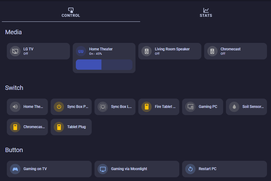
- Control is for entities that can be interacted with (think media_players, buttons, selects, etc.).
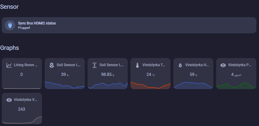
- Stats is for “read-only” entities like binary_sensors and sensors.
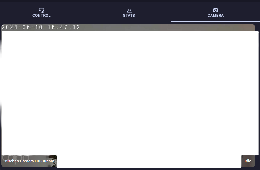
- Camera is for Camera-Streams.